Vintage Halloween decor transforms a generic seasonal display into a collected, intentional room in a single afternoon. This approach eliminates the plastic, mass-produced look that dominates most Halloween displays and replaces it with texture, patina, and real history. This guide delivers 21 specific strategies for sourcing, styling, and maintaining a vintage Halloween collection. Start with the foundation steps before buying a single piece.
Before You Begin: 4 Foundation Steps for Vintage Halloween Decor
Every strong vintage Halloween display starts with decisions made before any shopping happens. These four steps prevent the single biggest mistake in vintage collecting: buying pieces that don’t belong together.
1. Define Your Vintage Halloween Decade First
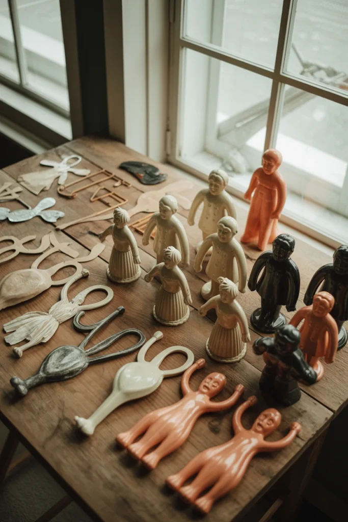
Most vintage Halloween displays fail because they mix decades with nothing in common. This forces the room into visual chaos, since 1920s crepe paper and 1960s plastic blow molds share no color story or material language.
Start by choosing one decade — 1920s–30s, 1940s–50s, or 1960s–70s — as your primary focus. Each decade has a distinct material signature: early decades favor die-cut paper and chalkware, while later decades lean into hard plastic and bold graphic prints. This single decision eliminates 80% of the mismatched purchases that make a display look thrifted rather than curated.
| Decade | Defining Materials |
| 1920s–1930s | Die-cut paper, honeycomb tissue, crepe paper |
| 1940s–1950s | Chalkware figures, cardboard lanterns |
| 1960s–1970s | Hard plastic blow molds, bold graphic tins |
| Reproduction era (2000s+) | Resin, mixed materials mimicking earlier decades |
2. Set a Budget Before You Start Sourcing
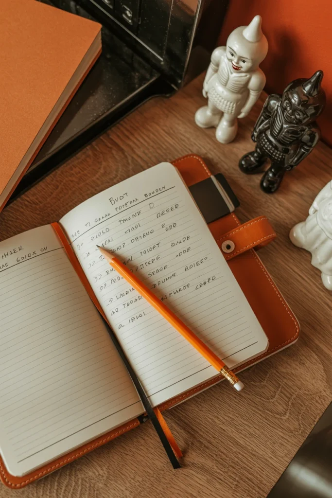
Vintage Halloween pieces range from $5 flea market finds to $400 rare Beistle originals. Without a ceiling set in advance, it becomes easy to overspend on a single showpiece and leave nothing for the vignettes that fill out the room.
Set two numbers before shopping: a per-item ceiling and a total seasonal budget. A workable starting split allocates 40% to one anchor piece, 40% to five to eight supporting pieces, and 20% held back for unexpected estate sale finds. This structure prevents the common trap of spending the entire budget on the first appealing piece found.
| Budget Tier | Total Seasonal Spend | Anchor Piece Ceiling |
| Starter | $75–150 | $30 |
| Mid-range | $200–400 | $100 |
| Established collector | $500–1,000 | $300 |
| Investment collector | $1,000+ | $500+ |
3. Choose One Anchor Piece for the Room
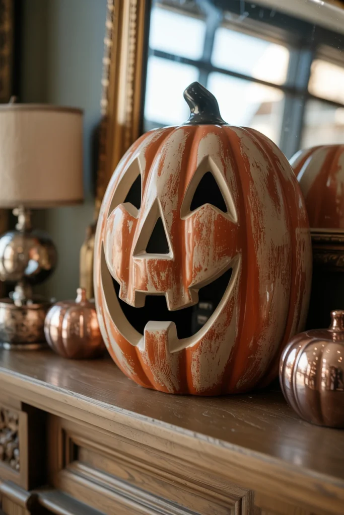
A room without an anchor piece reads as a scattered collection of small objects. This forces the eye to wander without landing anywhere, which makes the entire display feel unfinished even when it contains dozens of pieces.
Choose one piece at least 12 inches tall to serve as the visual anchor — a large chalkware jack-o’-lantern, a die-cut witch cutout, or a vintage blow-mold pumpkin. Place this piece at eye level in the room’s primary sightline before adding any smaller items around it. Every other piece in the room should be visually smaller or quieter than this anchor, which immediately gives the display a clear hierarchy.
| Anchor Piece Type | Ideal Placement Height |
| Large chalkware JOL | Mantel center, eye level |
| Die-cut witch or cat | Wall, 60–66 inches from floor |
| Blow-mold pumpkin | Entry table or porch step |
| Tin litho lantern | Console table, elevated on books |
4. Build a Reference Board of Vintage Halloween Colors
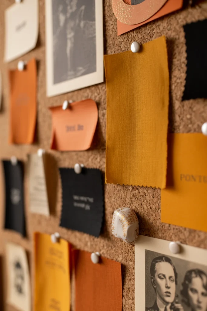
Buying pieces without a fixed color reference leads to a display with ten different shades of orange fighting each other. This makes even genuinely vintage pieces look disconnected once placed in the same room.
Pull five to seven reference images of original vintage Halloween ephemera and identify the two or three dominant colors shared across them — typically a muted pumpkin orange, a soft black, and one accent like harvest gold. Use this reference board every time a new piece is considered for purchase, rejecting anything that clashes with the established palette. This single habit keeps a growing collection cohesive even when pieces are bought months apart.
| Reference Color | Common Vintage Source |
| Muted pumpkin orange | Die-cut paper, chalkware base coat |
| Soft black | Cat silhouettes, witch hat die-cuts |
| Harvest gold | Honeycomb tissue accents |
| Olive green | Background printing on tin litho pieces |
Sourcing Authentic Vintage Halloween Decorations
Finding real vintage Halloween pieces takes a different search strategy than shopping seasonal aisles. These five methods locate authentic material without overpaying for reproductions sold as originals.
5. Hunt Estate Sales for Original Die-Cut Decorations
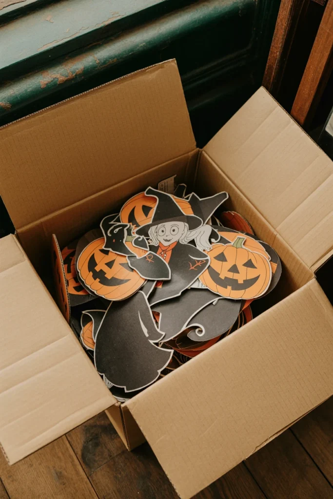
Retail stores stopped carrying genuine vintage die-cuts decades ago, which pushes serious buyers toward estate sales as the most reliable original source. Estate sales in homes owned by the same family for 40+ years frequently surface untouched Halloween boxes stored in attics.
Search estate sale listing sites for keywords like “attic find” or “collectibles” and filter for homes built before 1970. Arrive within the first hour of the sale opening, since paper ephemera sells within minutes at estate sales with any social media presence. Sellers who don’t recognize the value of die-cuts often price them under $10, well below their $40–80 secondary market value.
| Estate Sale Signal | What It Suggests |
| “Attic find” in listing | Higher chance of untouched original stock |
| Home built pre-1970 | More likely to hold period-correct decor |
| Early sale time slot | Paper goods still available |
| No online presale photos | Less competition from resellers |
6. Check Flea Markets for Chalkware Jack-O-Lanterns
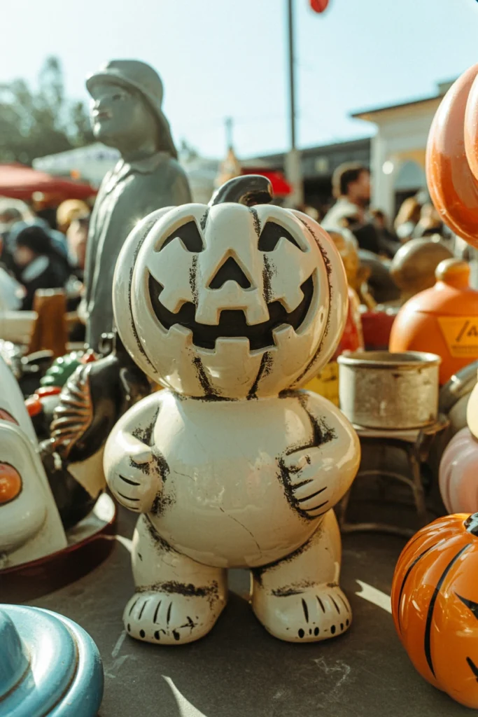
Chalkware jack-o’-lanterns from the 1940s and 1950s carry more weight and detail than anything sold today, but they chip easily and get mispriced by sellers unfamiliar with the material. Flea markets remain one of the few places these pieces still surface regularly at accessible prices.
Inspect every chalkware piece for hairline cracks along the base before buying, since this is the most common failure point. Run a hand along the paint surface to check for flaking, and expect to pay $25–60 for a piece in solid condition versus $10–20 for one needing repair. A chalkware piece with 80% of its original paint intact still displays beautifully once placed slightly turned to hide any worn side.
| Chalkware Condition | Typical Price Range |
| Mint, full original paint | $60–100 |
| Minor chips, 80%+ paint | $25–60 |
| Visible cracks, repairable | $10–25 |
| Heavy damage | Under $10, decorative only |
7. Buy Reproduction Honeycomb Tissue From Trusted Sellers
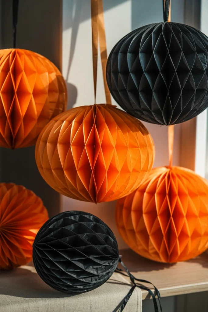
Original honeycomb tissue from the 1930s rarely survives intact, since the folded paper structure tears with normal handling and storage. Buying reproduction honeycomb tissue from specialty vintage-reproduction sellers fills this gap without misrepresenting the piece as original.
Search for sellers who explicitly label pieces as “reproduction” rather than vague terms like “vintage-style,” since the second phrase often signals an attempt to blur the line for resale. Reproduction honeycomb tissue in period-correct orange and black runs $8–15 per piece and holds up to repeated seasonal use far better than anything original would. This lets the fragile original pieces in a collection stay stored while reproductions absorb the wear of yearly display.
| Seller Label | What It Means |
| “Reproduction” | Newly made, period-accurate design |
| “Vintage-style” | Often new manufacture, ambiguous claim |
| “Vintage” | Should be original — verify with photos |
| “Antique” | Typically 100+ years, rare for Halloween |
8. Inspect Paper Items for Foxing Before Buying
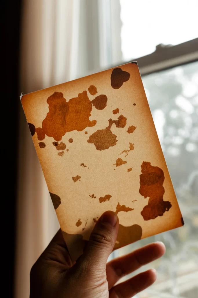
Foxing — the brown speckled staining on aged paper — spreads over time and eventually destroys the printed surface of die-cuts and postcards. Buying a piece already showing heavy foxing means the display life of that item is shorter than it appears.
Hold every paper item up to a light source before purchasing and look for brown spots concentrated near the edges, which signals early-stage foxing that will worsen with humidity exposure. Light foxing on the back of a piece is acceptable and often invisible once displayed, but foxing on the printed face reduces both value and display quality. Reject pieces with foxing covering more than 15% of the visible printed surface.
| Foxing Coverage | Buying Recommendation |
| None visible | Buy at full asking price |
| Under 15%, back only | Buy, negotiate 10% off |
| 15–30%, front visible | Buy only if rare, negotiate 30%+ off |
| Over 30% | Skip unless price under $5 |
9. Prioritize Beistle-Era Pieces for True Vintage Value
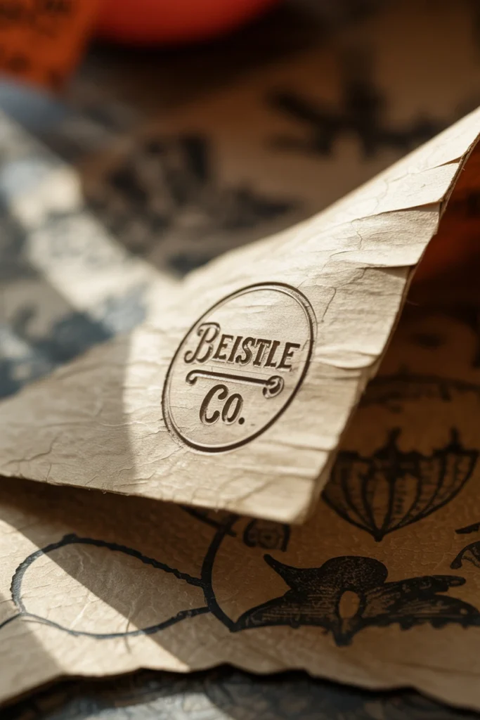
The Beistle Company has produced Halloween decorations since 1900, making original Beistle pieces the most collected and highest-value category in vintage Halloween. Pieces with visible Beistle markings hold value significantly better than unmarked pieces of similar age and style.
Look for the small printed “Beistle Co.” mark on the back or bottom edge of die-cuts, tissue items, and honeycomb pieces made before 1980. A marked Beistle piece from the 1950s typically sells for double an unmarked piece of the same design and condition, since the maker’s mark confirms both authenticity and origin. This makes checking for the mark the single fastest way to separate genuinely collectible pieces from generic period decor.
| Mark Found | Value Impact |
| Beistle Co., pre-1960 | Highest value tier |
| Beistle Co., 1960–1980 | Strong value, more common |
| Unmarked, period style | Moderate value |
| No mark, uncertain age | Lowest value, buy for display only |
Building a Vintage Halloween Color Palette and Materials
A cohesive vintage Halloween look depends on a consistent material and color story running through every piece in the room. These four strategies build that consistency from the ground up.
10. Anchor Your Palette in Muted Orange and Black
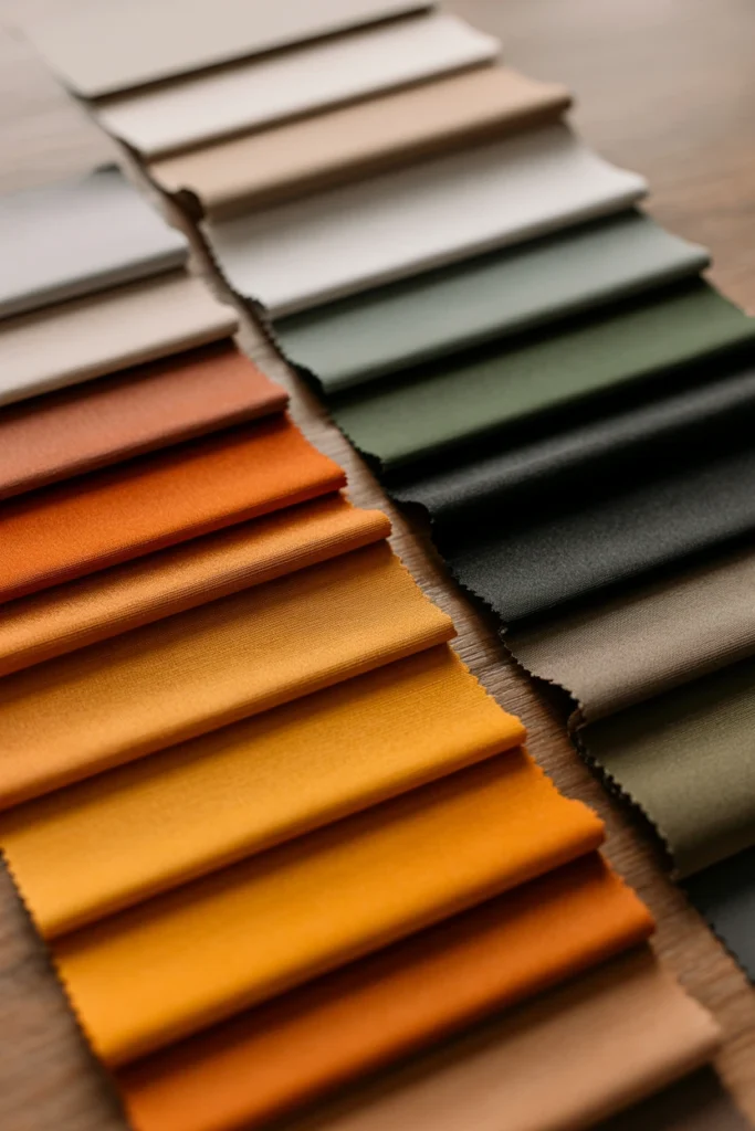
Bright, saturated orange reads as modern plastic even on a genuinely vintage piece, since original dyes faded and aged into softer tones over decades. Anchoring the palette in muted orange rather than bright orange instantly signals “collected” instead of “seasonal aisle.”
Select paint, ribbon, or fabric accents in a burnt or pumpkin-spice orange rather than traffic-cone orange, and pair it consistently with a soft, slightly warm black rather than true black. This two-color foundation should appear in at least 60% of the pieces displayed in the room. Rooms that follow this ratio read as intentionally curated even when the individual pieces come from five different sources.
| Color Type | Hex Range Reference |
| Muted pumpkin orange | #C4622D–#D97B3F |
| Soft aged black | #2B2B28–#1F1F1C |
| True black (avoid as primary) | #000000 |
| Bright traffic orange (avoid) | #FF6600 |
11. Layer in Harvest Gold and Olive as Secondary Tones
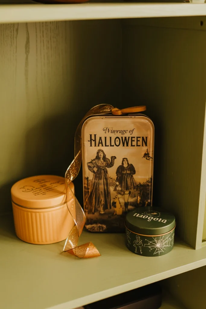
A display built only in orange and black flattens quickly and starts to read as one-note after the first few pieces. Layering in harvest gold and olive as secondary tones adds depth without breaking from the vintage color language.
Introduce these secondary colors through smaller supporting elements — ribbon, a vintage tin, a piece of fabric — rather than large pieces, keeping them to roughly 25% of the total color presence in the room. Harvest gold works especially well paired with honeycomb tissue accents, while olive pairs naturally with tin litho pieces from the 1960s. This layering technique is what separates a flat two-color display from one with genuine visual depth.
| Secondary Color | Best Paired Material |
| Harvest gold | Honeycomb tissue, ribbon |
| Olive green | Tin litho, printed cardboard |
| Rust brown | Chalkware base coats |
| Cream | Paper die-cuts, backing card |
12. Choose Crepe Paper Over Plastic for Texture
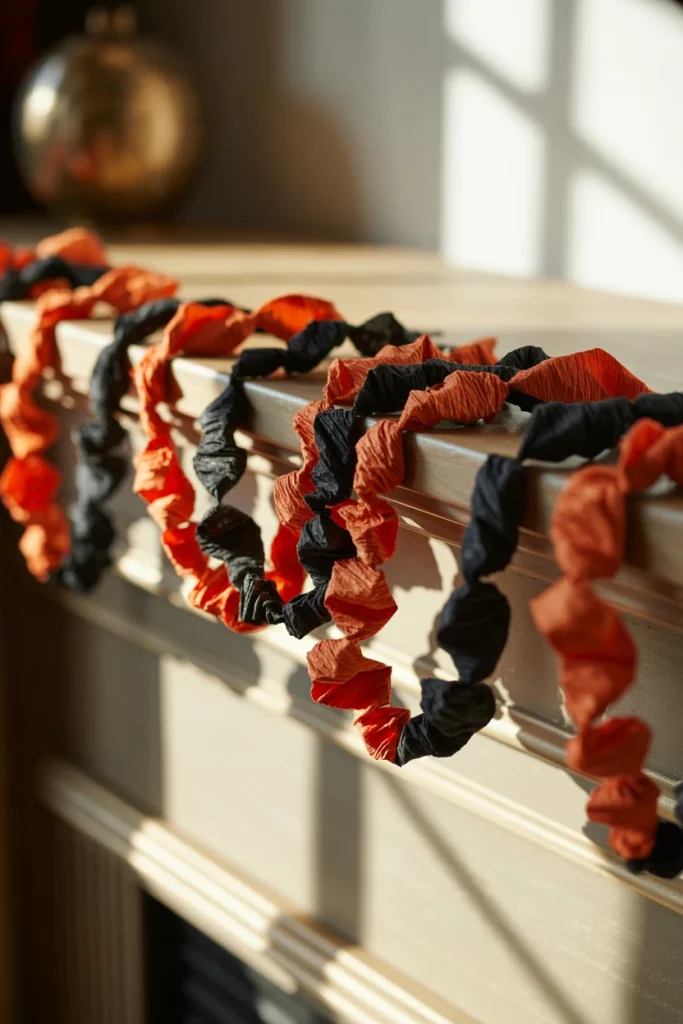
Plastic decorations reflect light evenly across their surface, which flattens a display under normal room lighting and makes everything look identical in texture. Crepe paper absorbs light instead, creating shadow and depth that plastic simply cannot replicate.
Replace any plastic garland, streamers, or accent pieces with crepe paper equivalents in the same muted palette established earlier. Twist crepe paper loosely rather than pulling it taut, since the slight rumpled texture reads as more authentic and catches light in a way flat plastic never does. A single roll of quality crepe paper costs under $5 and transforms more visual texture per dollar than any other material swap in this guide.
| Material | Light Behavior | Texture Result |
| Crepe paper | Absorbs, soft shadow | High texture, authentic |
| Tissue paper | Semi-absorbs | Moderate texture |
| Cardboard/paper | Matte, absorbs | High texture, structured |
| Plastic | Reflects evenly | Flat, no shadow depth |
13. Mix Metals With Aged Brass and Tin
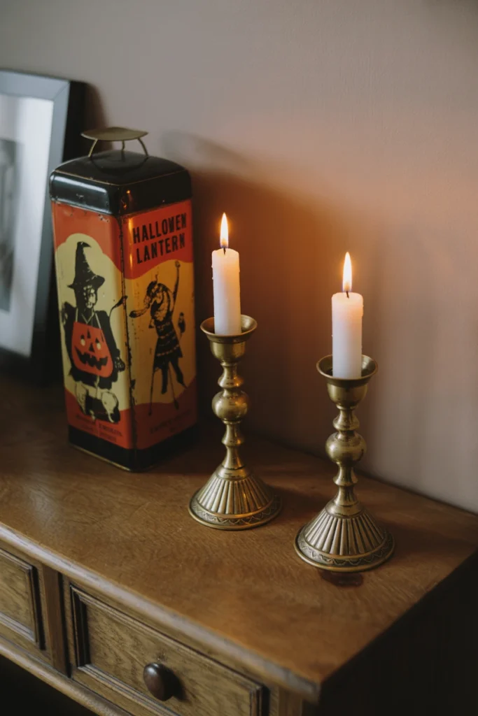
An all-black or all-orange display eventually needs a metal element to break up the flat color blocks and add the shine that period pieces genuinely had. Modern silver and chrome finishes read as contemporary and clash immediately with a vintage material story.
Introduce metal only through aged brass candle holders or original tin litho noisemakers and lanterns, both period-correct choices from the 1940s–60s Halloween era. Avoid anything with a bright, unweathered silver or chrome finish, since this single detail can undo an otherwise convincing vintage display. A $15 pair of aged brass candlesticks placed near the anchor piece adds more authenticity than any additional paper decoration would at the same price point.
| Metal Finish | Vintage Accuracy |
| Aged brass | High — period correct |
| Vintage tin litho | High — original material |
| Brushed nickel | Low — modern finish |
| Chrome/polished silver | Very low — reads as modern |
Styling Vintage Halloween Vignettes and Finishing Touches
Individual pieces only read as a collection once arranged with intentional groupings and heights. These four techniques turn a shelf of separate objects into a cohesive vignette.
14. Group Figurines in Odd-Numbered Vignettes
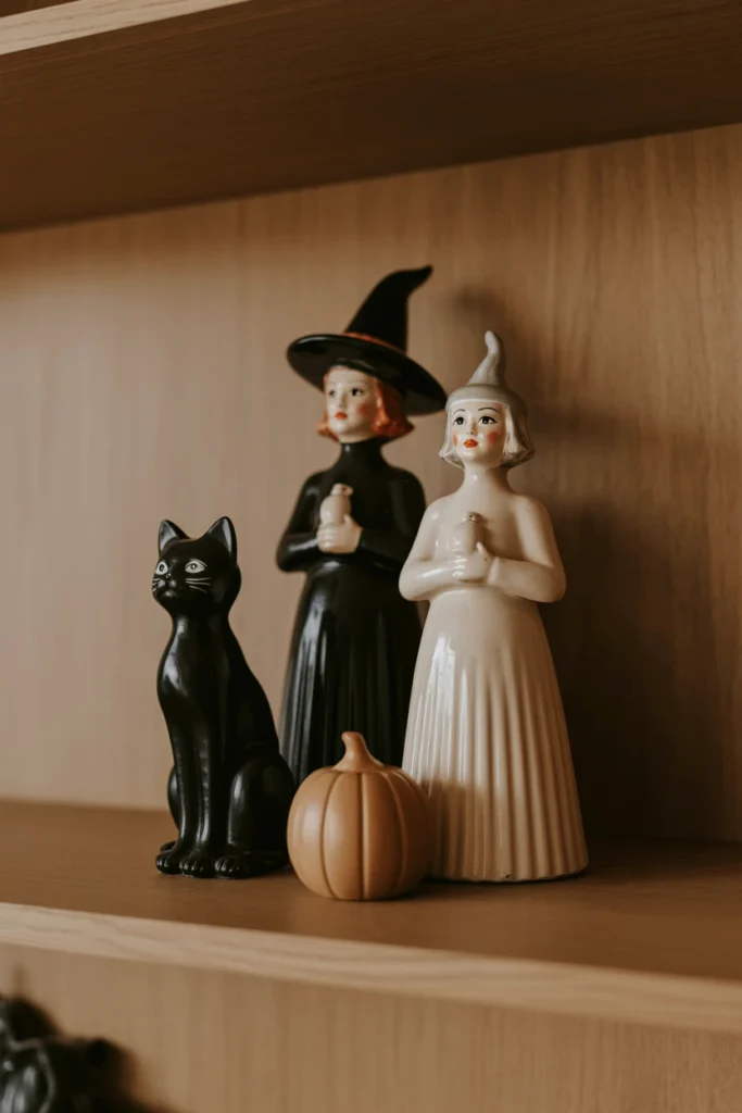
Even-numbered groupings of figurines create visual symmetry that reads as staged rather than collected. Odd-numbered groupings — three or five pieces — break that symmetry and immediately read as gathered over time rather than purchased as a matched set.
Arrange figurines in clusters of three, varying height and size within each cluster rather than lining pieces up in a row. Place the tallest piece slightly off-center within the group rather than dead center, which mimics how a genuine collection accumulates naturally rather than arrives pre-arranged. This single grouping rule applies to every shelf, mantel, and table vignette throughout the display.
| Grouping Size | Visual Effect |
| 2 pieces | Reads as paired, static |
| 3 pieces | Reads as collected, dynamic |
| 4 pieces | Reads as staged, symmetrical |
| 5 pieces | Reads as abundant, curated |
15. Layer Height With Books Under Small Pieces
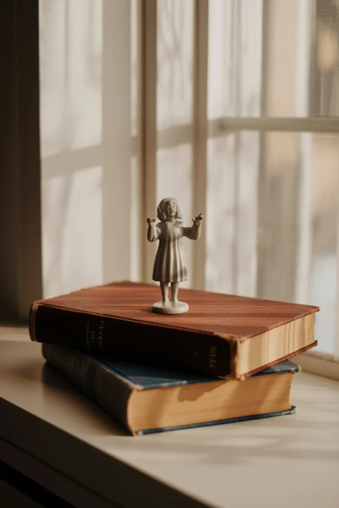
Small figurines placed directly on a flat shelf surface all sit at the same visual height, which makes the eye skim past the entire grouping without landing anywhere. Layering height into the display gives each piece its own visual moment.
Stack two or three vintage or neutral-colored books under the shortest pieces in each vignette, raising them 2–4 inches above the shelf surface. Keep book heights varied across the vignette rather than using identical stack heights for every piece, since uniform heights recreate the same flatness problem in a new form. This technique alone can make a five-piece vignette look twice as intentional without adding a single new decoration.
| Piece Height (Original) | Recommended Book Lift |
| Under 3 inches | 3–4 inch lift |
| 3–5 inches | 2–3 inch lift |
| 5–8 inches | 1–2 inch lift |
| Over 8 inches | No lift needed |
16. Anchor the Mantel With One Oversized JOL
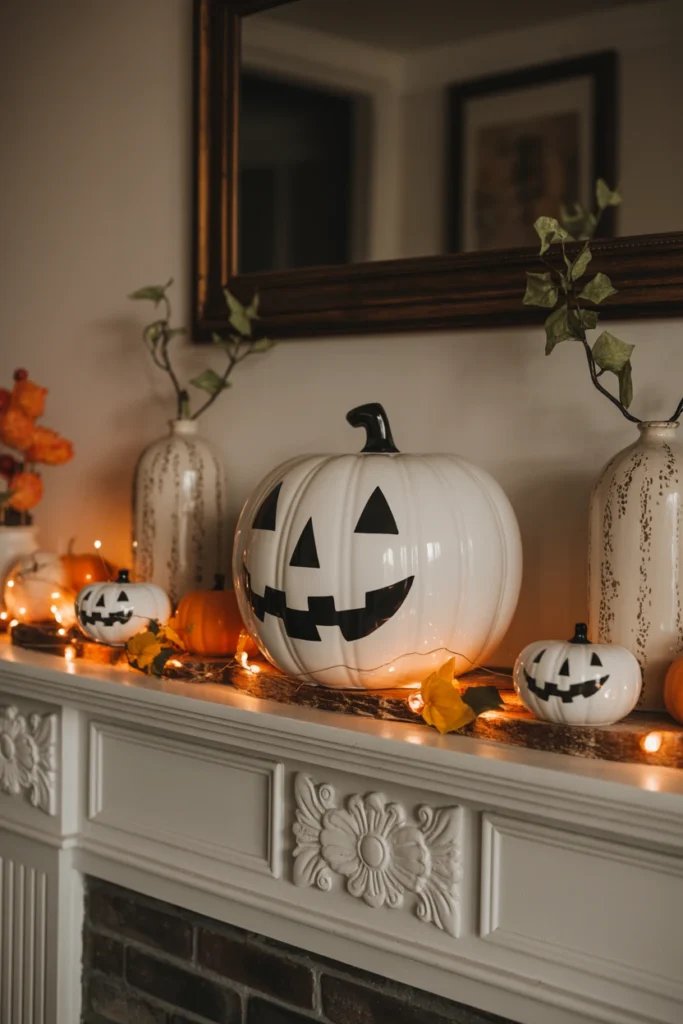
A mantel filled with only small pieces has no clear focal point, which forces visitors’ eyes to bounce across the entire surface without resting anywhere. One oversized jack-o’-lantern piece solves this immediately by giving the mantel a single dominant feature.
Place a chalkware or blow-mold jack-o’-lantern at least 10 inches tall at the mantel’s center or slightly off-center, then build all supporting pieces at a smaller scale around it. Keep the space directly around the oversized piece slightly emptier than the rest of the mantel, since crowding the anchor piece diminishes its visual weight. This breathing room is what separates a mantel that reads as curated from one that reads as cluttered.
| Mantel Length | Recommended JOL Height |
| Under 48 inches | 8–10 inches |
| 48–60 inches | 10–14 inches |
| 60–72 inches | 12–16 inches |
| Over 72 inches | 14+ inches, consider two anchors |
17. Hang Die-Cuts at Eye Level, Not Higher
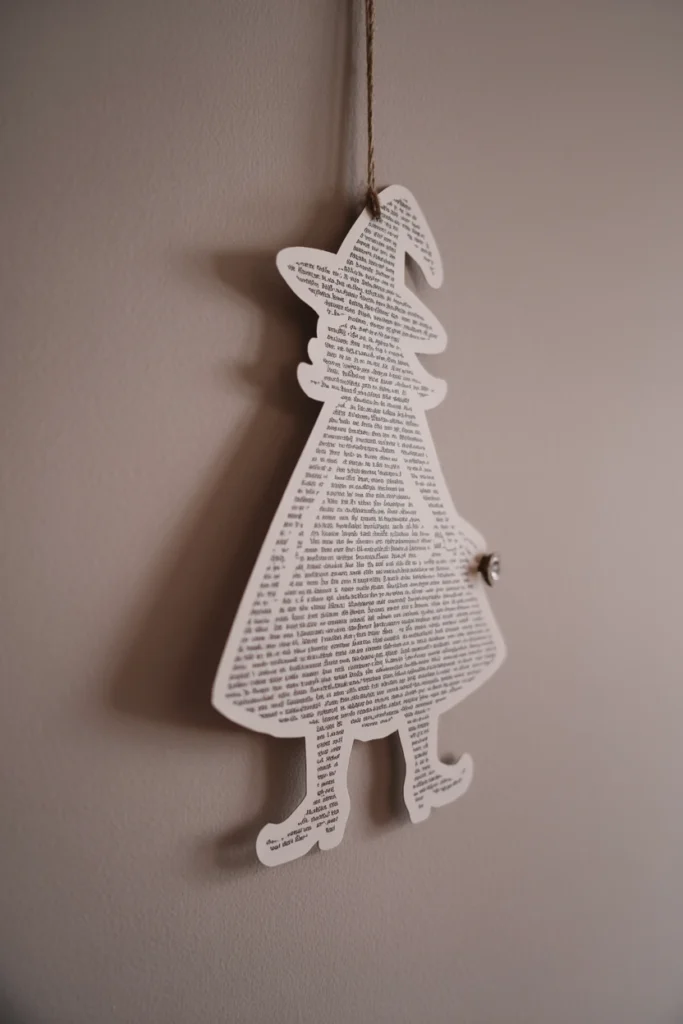
Die-cut decorations hung too high on a wall lose their detail and become decorative noise rather than a focal element people actually notice. This wastes the most detailed and often most valuable pieces in a vintage Halloween collection.
Hang die-cuts between 57 and 63 inches from the floor to the center of the piece, which matches standard eye-level gallery placement used in professional interiors. Cluster two or three die-cuts together at this height rather than spacing single pieces high on the wall, since clustering at eye level creates the same collected effect as the figurine grouping strategy. This single height adjustment makes the detail work in vintage die-cuts actually visible to anyone standing in the room.
| Wall Placement Height | Visual Result |
| 57–63 inches (eye level) | Detail fully visible |
| 64–72 inches | Detail starts to lose impact |
| Above 72 inches | Reads as decorative blur only |
| Below 50 inches | Reads as low, off-balance |
Maintaining Your Vintage Halloween Collection Long-Term
Vintage pieces degrade faster than modern decor without proper care between seasons. These four habits protect the collection’s value and appearance year over year.
18. Store Paper Pieces Flat in Acid-Free Sleeves
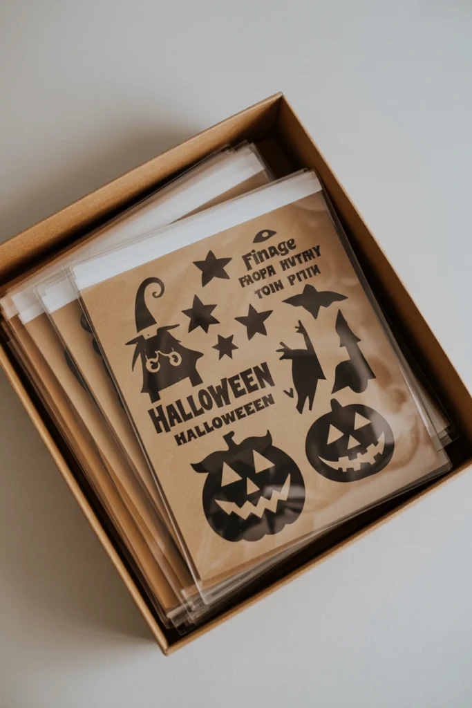
Folding or rolling paper die-cuts and tissue pieces for storage creates permanent creases that crack the printed surface within a few seasons. Acid-free flat storage prevents this damage entirely while also slowing the foxing process discussed earlier.
Store every paper piece flat inside an acid-free archival sleeve, then stack sleeves inside a rigid, flat storage box rather than a folding container. Keep the storage box in a climate-stable area away from attics or basements, since humidity swings accelerate both foxing and mold growth on paper. Acid-free sleeves cost roughly $0.50–1 per piece, a small cost against the $40–80 replacement value of a single original die-cut.
| Storage Method | Paper Longevity |
| Flat, acid-free sleeve | Decades, minimal damage |
| Flat, standard folder | Years, some acid damage |
| Rolled | Permanent creasing risk |
| Folded | Cracking along fold lines |
19. Rotate Displayed Pieces Each Season to Limit Fading
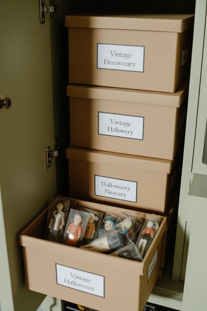
Displaying the same pieces in the same sun-exposed spot every year accelerates color fading, particularly on paper and chalkware items with painted surfaces. Rotating which pieces go on display each season spreads this exposure across the full collection instead of concentrating damage on a favorite few.
Keep a simple record of which pieces were displayed in high-light areas the previous year and swap them out for less-exposed pieces this season. Reserve any piece with significant monetary or sentimental value for lower-light placement year-round rather than rotating it into direct window light at all. This single habit can extend the display life of a painted chalkware piece by several years compared to constant sun exposure.
| Light Exposure | Fading Risk Per Season |
| Direct window sun | High |
| Indirect daylight | Moderate |
| Lamp-lit interior spot | Low |
| Storage, no light | None |
20. Establish a Yearly Inventory of Fragile Items
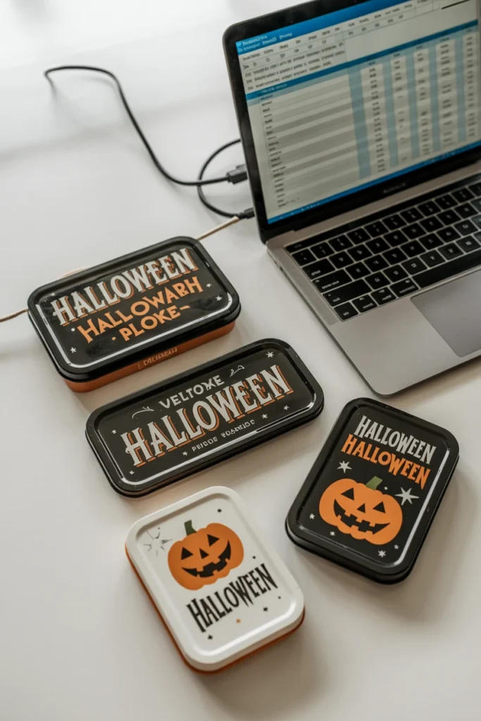
Collections that grow without tracking eventually lose pieces to breakage, misplacement, or simple forgetting during storage transitions. A yearly inventory catches damage early and prevents fragile pieces from being packed incorrectly the following season.
Photograph every fragile piece — chalkware, tin litho, glass — at the start of each season and note any new chips, cracks, or fading compared to the prior year’s photo. Keep this inventory in a simple spreadsheet or folder rather than relying on memory, since a collection of 20+ pieces becomes impossible to track accurately without a record. This 30-minute yearly task catches small damage before it becomes a piece-ending problem.
| Inventory Task | Recommended Frequency |
| Photograph each piece | Once per year, before display |
| Note new damage | Once per year, before storage |
| Full condition report | Every 2–3 years |
| Insurance appraisal | Every 5 years, high-value pieces |
21. Replace Damaged Reproductions Before They Degrade Originals
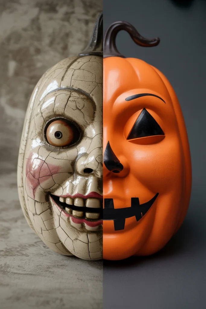
A damaged reproduction piece stored alongside original vintage items can transfer damage — flaking paint, tearing paper, or moisture — to the more valuable originals nearby. Reproductions are meant to absorb wear, but only if replaced before that wear becomes a storage hazard.
Inspect reproduction pieces at the end of each season and replace any showing flaking, tearing, or structural weakness before packing the collection away together. Store reproductions in a separate container from originals whenever a reproduction shows any sign of active deterioration. This small separation habit protects the long-term value of the original pieces that took the most effort to source.
| Reproduction Condition | Storage Action |
| Good, no visible wear | Store with originals |
| Minor wear, stable | Store separately, monitor |
| Active flaking/tearing | Replace before storage |
| Structural damage | Discard, do not store |
Common Vintage Halloween Decorating Mistakes That Cheapen the Look
These mistakes appear repeatedly in displays that mix vintage and modern pieces without a clear plan. Each one has a specific, correctable alternative.
| Mistake | Why It Hurts the Space | Better Alternative |
| Mixing bright plastic with muted vintage pieces | Plastic sheen breaks the aged color story instantly | Swap plastic accents for crepe paper or tin |
| Displaying every piece at the same height | Flattens the vignette, nothing draws the eye | Layer height with books or risers |
| Using pure black instead of soft black | Reads as Halloween-store generic, not collected | Choose soft, slightly warm black tones |
| Skipping condition checks before buying | Fragile pieces arrive already damaged | Inspect for cracks, foxing, and flaking first |
| Hanging die-cuts above eye level | Detail becomes invisible from normal sightlines | Hang at 57–63 inches from the floor |
| Buying without a decade focus | Pieces from different eras visually clash | Commit to one decade before sourcing |
| Overcrowding the anchor piece | Anchor loses visual weight and gets lost | Leave breathing room around the focal piece |
| Storing paper folded or rolled | Creates permanent creases and cracks | Store flat in acid-free sleeves |
Vintage Halloween Decor by Space
Front Porch and Entryway
Porches and entryways face weather exposure and first-impression pressure that indoor rooms don’t, which limits which vintage pieces belong here. This space needs weather-resistant anchor pieces paired with a few smaller vintage touches near the door.
Key strategies for front porch and entryway:
- Use a blow-mold pumpkin as the weather-safe anchor piece near the door
- Reserve fragile paper die-cuts for a covered, wind-protected area only
- Hang a single wreath built from crepe paper and dried florals instead of plastic
- Place aged brass lanterns on either side of the entry for symmetry at the door
- Add a vintage tin sign or plaque angled away from direct rain exposure
- Bring fragile pieces indoors overnight if the porch is not covered
Mantel and Shelf Display
The mantel functions as the room’s primary focal point, which means it carries more visual weight than any other surface in a vintage Halloween display. This space rewards careful height layering and a single strong anchor piece.
Key strategies for mantel and shelf display:
- Center the oversized JOL anchor piece with balanced negative space
- Use garland only along the mantel edge, never draped across the front
- Group smaller figurines in odd numbers at varying heights
- Add one framed vintage Halloween postcard leaning against the mirror
- Keep the color palette to three tones maximum across the full mantel
- Leave at least 20% of the surface visually empty for breathing room
Dining Table and Tablescape
A dining table display needs to function around place settings and sightlines across the table, unlike a static mantel. Pieces here should stay low enough not to block conversation between seated guests.
Key strategies for dining table and tablescape:
- Keep the centerpiece under 12 inches tall to preserve sightlines
- Use a table runner in muted orange rather than a full tablecloth swap
- Place small chalkware pieces at each place setting as favors
- Add taper candles in aged brass holders down the table’s center line
- Scatter a few loose paper leaves or die-cuts rather than clustering them
- Remove any fragile piece before guests are seated to prevent breakage
Small Apartment or Rental
Small spaces and rental restrictions limit both quantity of pieces and how decorations attach to walls. This segment needs a display that concentrates impact into one or two zones rather than spreading thin across the whole apartment.
Key strategies for small apartment or rental:
- Concentrate the full display on one shelf or console rather than the whole room
- Use removable adhesive hooks for any hanging die-cut pieces
- Choose one anchor piece under 10 inches to suit smaller surfaces
- Skip floor-standing pieces that consume walking space in tight rooms
- Store the bulk of the collection and rotate only 5–6 pieces on display
- Use a window as a natural backdrop instead of adding wall decor
Frequently Asked Questions
how to decorate for vintage halloween
Start with one decade, one anchor piece, and a two-to-three color palette before buying anything else. Build outward from the anchor piece with odd-numbered groupings and layered heights. Vintage Halloween decor works best when every piece supports one consistent color and era story rather than mixing eras freely.
what not to do with vintage halloween decor
Avoid mixing bright plastic pieces with muted vintage items, since the sheen and saturation clash immediately. Skip displaying everything at the same height, which flattens the entire vignette. Also avoid buying without checking condition first, since chalkware and paper pieces both hide damage that shows up after purchase.
how to start a vintage halloween collection on a budget
Set a starter budget between $75 and $150 and focus spending on one $30 anchor piece plus five to eight smaller supporting items. Prioritize flea markets and estate sales over specialty vintage shops, since prices run significantly lower. Reproduction pieces fill in gaps affordably while original pieces get added gradually over multiple seasons.
how to decorate a small apartment for vintage halloween
Concentrate the entire vintage Halloween display onto one console or shelf rather than spreading pieces across the apartment. Use removable adhesive hooks for any hanging pieces to stay rental-safe. Rotate five to six pieces from storage rather than displaying an entire collection at once in limited square footage.
real vs reproduction vintage halloween decorations
Real vintage pieces show age-appropriate wear like foxing, chalk chipping, or faded paint, while reproductions look uniformly new regardless of the printed design style. Reproduction sellers should label pieces clearly rather than using vague terms like “vintage-style.” Both real and reproduction pieces have a place in a vintage Halloween display when handled with the right expectations.
how often should you refresh halloween decor
Rotate which pieces get displayed each season rather than refreshing the entire collection yearly. This spreads light exposure and handling wear across more pieces instead of concentrating damage on a few favorites. A full collection refresh with new purchases works well every two to three seasons rather than annually.
does vintage halloween decor work for a modern house
Vintage Halloween decor works in modern interiors when concentrated into one or two focal zones rather than spread throughout every room. The muted color palette and paper textures contrast intentionally against clean modern lines. Limiting the vintage display to a mantel, console, or entry table keeps the effect curated rather than overwhelming a minimalist space.
how much does vintage halloween decor cost
A starter vintage Halloween display runs $75–150 total, while an established collection with rarer Beistle-era pieces can reach $500–1,000. Individual chalkware pieces range from $10–100 depending on condition, and original die-cuts typically sell for $15–80. Reproduction pieces cost significantly less, usually $5–20 per item.
how to store vintage halloween decorations
Store paper pieces flat inside acid-free archival sleeves within a rigid, flat storage box rather than folding or rolling them. Keep chalkware pieces individually wrapped and cushioned to prevent chipping during the off-season. Store the full collection in a climate-stable area away from attics or basements to limit humidity damage.
Conclusion
A vintage Halloween display built on one decade, one anchor piece, and a consistent muted palette reads as collected rather than decorated. Start by defining that decade and sourcing a single anchor piece before adding any supporting decor. Set a per-item budget ceiling today and inspect the first three pieces considered for foxing, cracks, or flaking before buying.
Vintage Halloween collecting rewards consistent seasonal habits — rotation, inventory checks, and proper storage — more than any single large purchase. A collection maintained this way only grows more valuable and more visually cohesive with every passing season.