Witchy decor transforms an ordinary room into a personal sanctuary built around ritual, texture, and moody atmosphere. This style creates a space that feels intentional and layered instead of themed or costume-like. This guide delivers 20 specific techniques for color, lighting, altar styling, and seasonal rotation. Start with your color palette before you buy a single crystal or candle.
Before You Begin: 4 Foundation Steps for Witchy Decor
Every successful witchy space starts with structure, not objects. These four steps set the foundation that every later tip builds on.
1. Choose a Muted Color Palette First
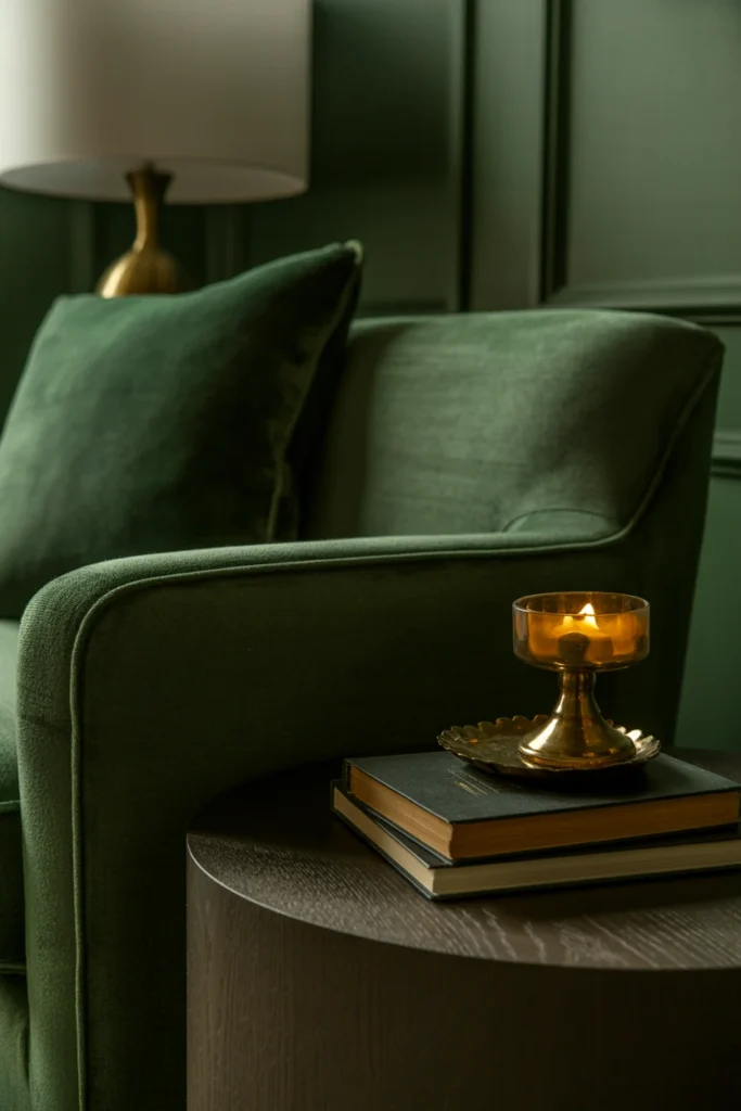
A scattered color palette is the single most common reason witchy decor reads as cluttered instead of curated. Without one dominant tone family, every object competes for attention and the room loses its sense of atmosphere. A defined palette immediately unifies dozens of mismatched objects into one cohesive visual story.
Start by picking one dominant dark tone — charcoal, deep forest, or aubergine — for at least 60% of your visible surfaces. Layer in no more than two accent colors, such as rust and antique gold, at a 30/10 ratio. This restraint makes every candle, jar, and textile feel like it belongs to the same collection rather than a random assortment.
| Base Tone | Best Accent Pairing |
| Charcoal black | Rust orange, brass |
| Deep forest green | Aged gold, cream |
| Aubergine purple | Antique silver, bone white |
| Espresso brown | Blood orange, copper |
2. Establish One Focal Wall for Your Aesthetic
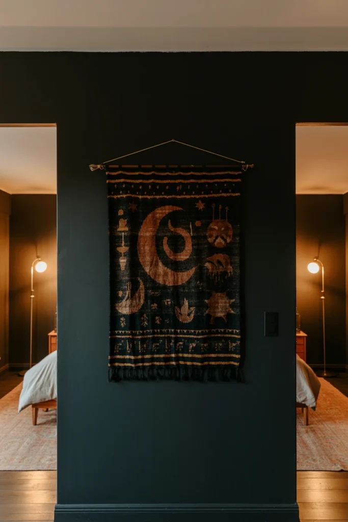
A room without a focal point forces the eye to wander and never land. This makes even well-chosen objects feel disconnected from each other, scattered instead of arranged with purpose. One dedicated wall gives the entire room a visual anchor everything else supports.
Choose the wall directly opposite your main entry point as your focal wall. Paint it in your dominant dark tone or hang a single large tapestry no smaller than 4×5 feet as the anchor piece. Every other design decision in the room should visually reference back to this wall’s tone and texture.
| Wall Treatment | Ideal Room Size |
| Full dark paint | Any room over 100 sq ft |
| Large tapestry | Rental, no paint allowed |
| Botanical mural panel | Bedroom, reading nook |
| Framed gallery cluster | Small studio apartment |
3. Anchor the Room With a Dedicated Altar Space
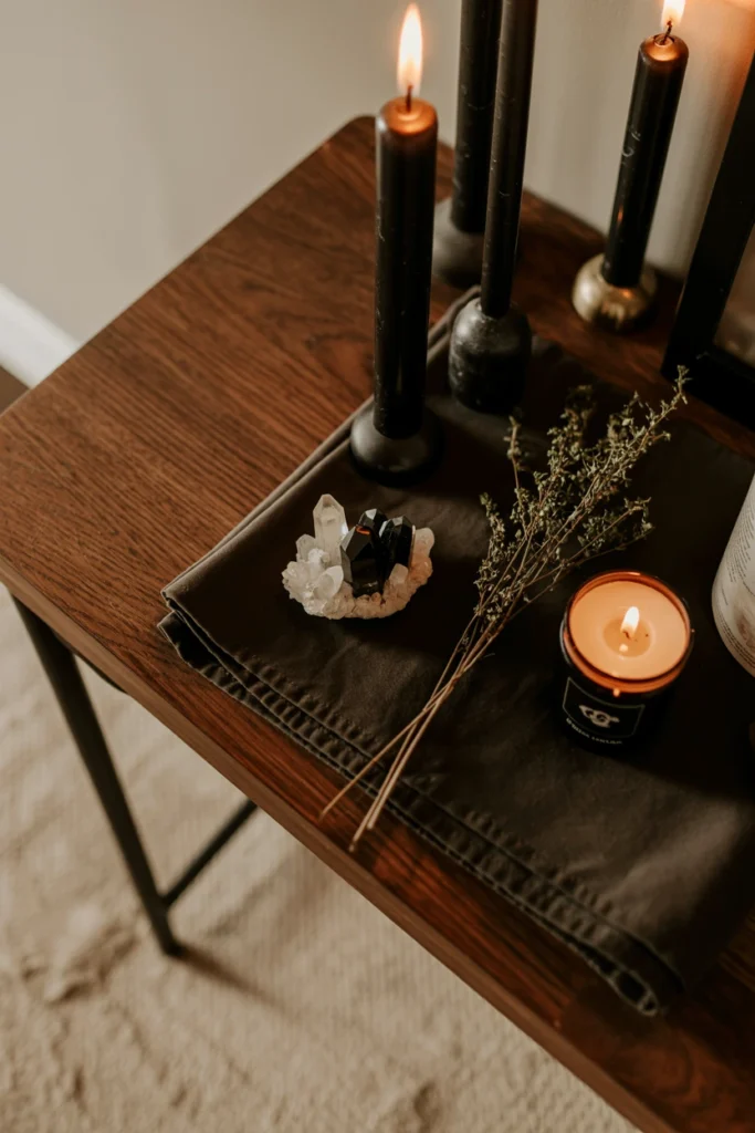
A room without one clear ritual surface scatters candles and crystals across every shelf, making the whole space feel unfinished. This forces guests and the resident’s own eye to hunt for the room’s actual purpose instead of recognizing it instantly. One dedicated altar surface instantly signals intention and gives every other object in the room a place to reference.
Select a surface between 24 and 36 inches wide — a dresser top, console table, or floating shelf works. Cover it with a dark cloth and limit the objects on it to nine or fewer at any time. This restraint keeps the altar legible as a focal ritual space rather than general storage overflow.
| Surface Type | Ideal Width |
| Floating shelf | 24 inches |
| Console table | 30–36 inches |
| Dresser top | 32–40 inches |
| Windowsill ledge | 12–18 inches |
4. Layer Lighting Instead of One Overhead Fixture
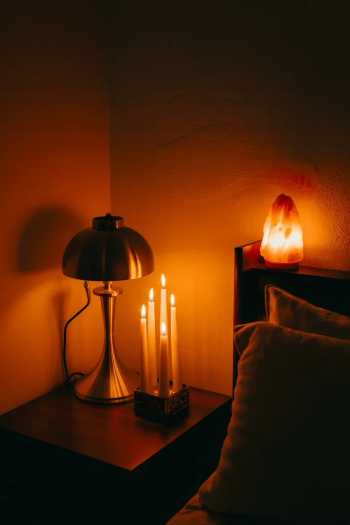
A single overhead light flattens every texture and shadow that makes witchy decor feel atmospheric. This single-source lighting erases the depth that dried herbs, crystals, and dark textiles are designed to create. Layered lighting immediately restores that depth and makes the same objects look dimensional instead of flat.
Install at least three separate light sources per room: one low-level lamp, one candle cluster, and one accent source like a salt lamp or string lights. Keep bulb temperature at 2200–2700K — anything cooler washes out the warm, aged tone the aesthetic depends on. This layered setup creates shifting shadows throughout the day that a single fixture never can.
| Light Source | Recommended Wattage/Temp |
| Table lamp | 40W, 2200K |
| Candle cluster | 3–5 candles, varied height |
| String lights | 2700K warm white |
| Salt lamp | 15–20W equivalent |
Building Your Witchy Home Decor Color Story
Color carries most of the emotional weight in witchy decor. These techniques extend your foundation palette into every surface of the room.
5. Use Deep Jewel Tones as Your Base
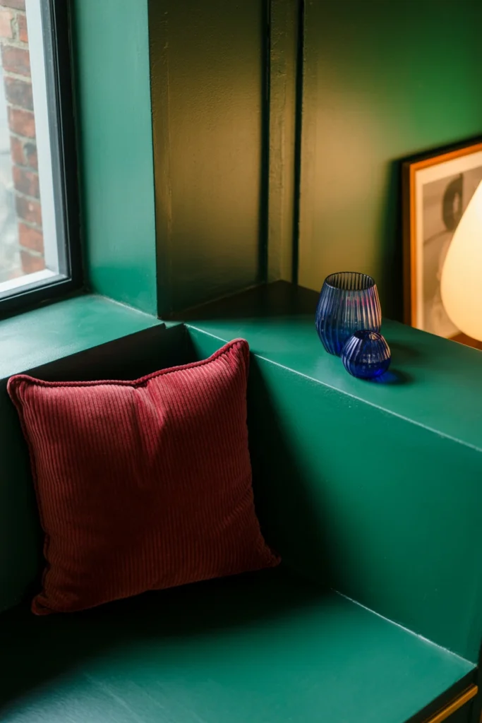
Pastel and neutral tones read as generic decor rather than witchy decor, no matter how many crystals sit on top of them. This mismatch between wall color and object choice undercuts every other styling decision in the room. Deep jewel tones instead give every object below them a rich, saturated backdrop to stand out against.
Paint at least one wall or drape one large textile in emerald, garnet, or sapphire tones with a light reflectance value under 15%. Reserve lighter neutrals for trim and ceiling only, never for a primary surface. This dark base makes gold hardware and candlelight visibly glow instead of blending into a pale backdrop.
| Jewel Tone | LRV Range |
| Emerald green | 8–12% |
| Garnet red | 6–10% |
| Sapphire blue | 5–9% |
| Amethyst purple | 7–11% |
6. Add Black Accents in Frames and Hardware
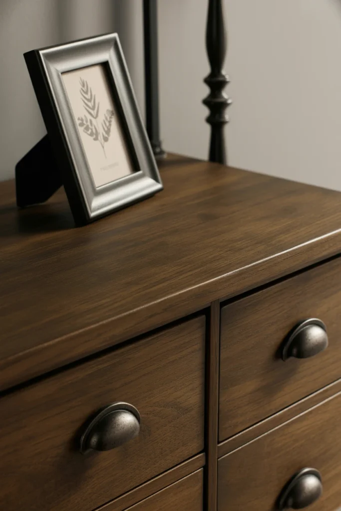
Gold or silver hardware alone reads as glam decor, not witchy decor, because it lacks the grounding weight the aesthetic needs. Without a darker anchoring metal, the room drifts toward a generic maximalist look instead of a mystical one. Black hardware and frames immediately ground the sparkle of gold accents and root the room in the aesthetic.
Swap out light-colored picture frames, drawer pulls, and curtain rods for matte black versions in the same room. Limit black to hardware and framing only — covering more than 20% of a surface in flat black reads as heavy rather than accented. This single swap ties together mismatched furniture pieces that otherwise share no visual connection.
| Hardware Type | Finish to Choose |
| Drawer pulls | Matte black iron |
| Picture frames | Black lacquer, thin edge |
| Curtain rods | Black iron, 1-inch diameter |
| Light fixtures | Black metal, exposed bulb |
7. Mix Metallic Finishes Sparingly
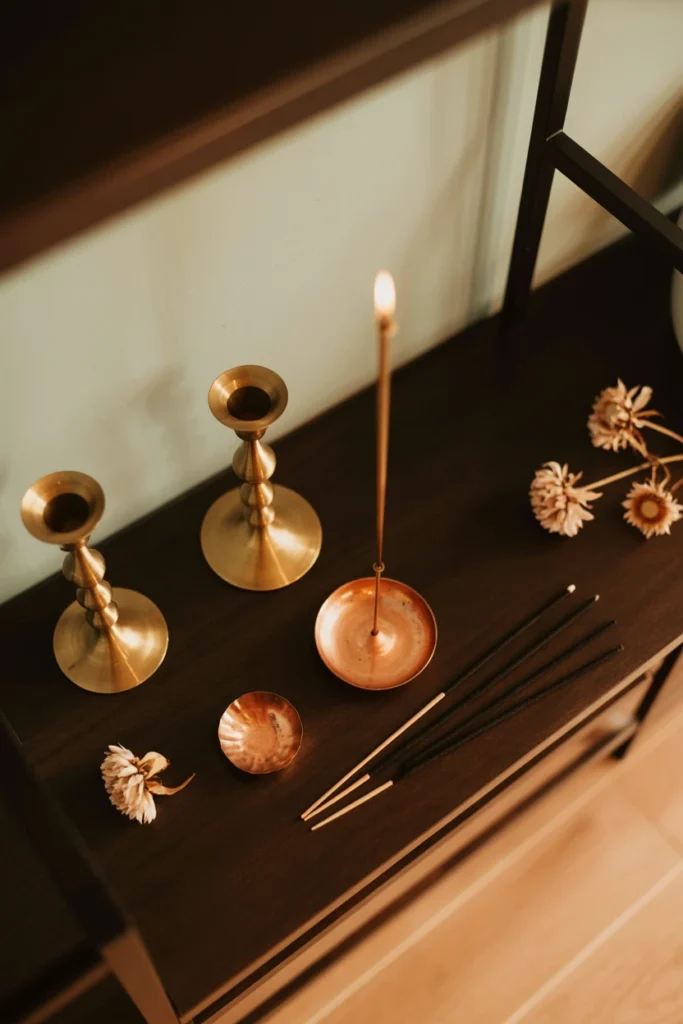
Too many competing metallic finishes in one room makes every object look like it came from a different store instead of one collection. This visual noise undercuts the cohesive, collected feeling witchy decor depends on. Limiting your room to two metallics maximum instantly resolves that noise into a deliberate, layered look.
Choose one dominant metal — aged brass or antique gold — for 80% of your metallic objects, candlesticks, and frames. Reserve a second metal, like pewter or copper, for no more than two accent pieces in the room. This two-metal rule keeps candlesticks, jar lids, and mirror frames reading as intentionally paired rather than accidentally mismatched.
| Metal Pairing | Ratio |
| Brass + copper | 80/20 |
| Antique gold + pewter | 80/20 |
| Aged silver + black iron | 70/30 |
| Bronze + brass | 75/25 |
8. Introduce Blood Orange or Rust as an Accent
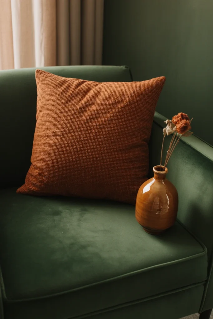
A room built entirely from black, green, and purple tones can start to feel cold and lifeless without a warm counterpoint. This absence of warmth makes candlelight and skin tones look washed out against the dark backdrop. A single warm accent color instantly balances the palette and makes the whole room feel inhabited rather than staged.
Add rust or blood orange through no more than three objects — a throw pillow, a ceramic vessel, or dried flowers. Keep this warm accent to under 10% of total visible color in the room to avoid competing with your dominant dark tone. This small warm note is what makes deep jewel-toned rooms photograph as rich rather than flat.
| Accent Object | Ideal Placement |
| Throw pillow | Reading chair, bed |
| Ceramic vase | Altar or shelf edge |
| Dried flowers | Mantel, bookshelf |
| Woven basket | Floor corner |
Styling Your Altar and Apothecary Display
The altar is the visual centerpiece of witchy decor. These techniques turn a random collection of objects into a deliberate, gallery-like display.
9. Group Objects in Odd-Numbered Vignettes
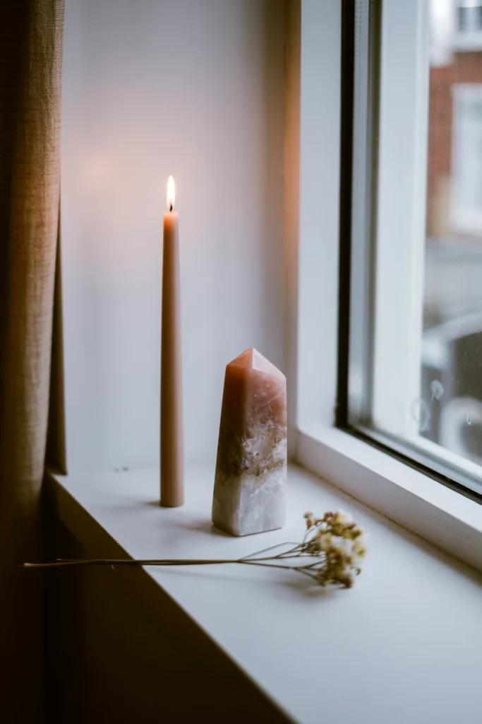
Even-numbered groupings of candles or crystals create visual symmetry that reads as staged rather than collected over time. This staged quality is the opposite of the personal, gathered feeling witchy decor is meant to convey. Odd-numbered groupings immediately break that symmetry and read as intentional, curated collections instead.
Arrange every display in groups of three or five objects, never two or four. Vary the height of each item within the group by at least two inches so the eye moves naturally across the arrangement. This height variation is what separates a genuine vignette from a simple row of matching objects.
| Group Size | Best Use |
| 3 objects | Small shelf, windowsill |
| 5 objects | Altar table, console |
| 7 objects | Large mantel display |
| 9 objects | Maximum before it reads cluttered |
10. Display Dried Herbs in Amber Apothecary Jars

Clear glass jars expose dried herbs to direct light, which fades their color and makes the whole apothecary display look faded and cheap within weeks. This visible fading undercuts the aged, collected look the display is meant to achieve. Amber or cobalt glass jars instead protect the herbs and immediately read as authentic apothecary storage rather than kitchen pantry jars.
Store each herb variety in its own 4- to 8-ounce amber glass jar with a cork or black metal lid. Label each jar with a small handwritten or printed tag rather than a printed sticker, which reads as mass-produced. This labeling detail is what makes a shelf of jars look like a working apothecary instead of a display prop.
| Jar Size | Herb Quantity |
| 4 oz | Single-use dried flowers |
| 8 oz | Common herbs, loose tea |
| 16 oz | Bulk botanicals, root pieces |
| 2 oz | Rare or expensive dried herbs |
11. Layer Candles at Three Different Heights
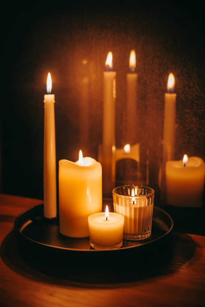
Candles placed at one uniform height create a flat silhouette that disappears against a dark wall instead of creating depth. This flatness wastes the single most atmospheric object in the entire room. Three varied heights instead create layered shadows on the wall behind them that shift and move as the candles burn.
Combine a taper candle at 10–12 inches, a pillar candle at 4–6 inches, and a votive at 2–3 inches within the same cluster. Space each height at least 3 inches apart so the shadows they cast do not merge into one shape. This height variation is what makes a candle cluster look like a deliberate still-life rather than a random collection of leftover candles.
| Candle Type | Height Range |
| Taper | 10–12 inches |
| Pillar | 4–6 inches |
| Votive | 2–3 inches |
| Chime | 4 inches, thin diameter |
12. Arrange Crystals by Size, Not Type
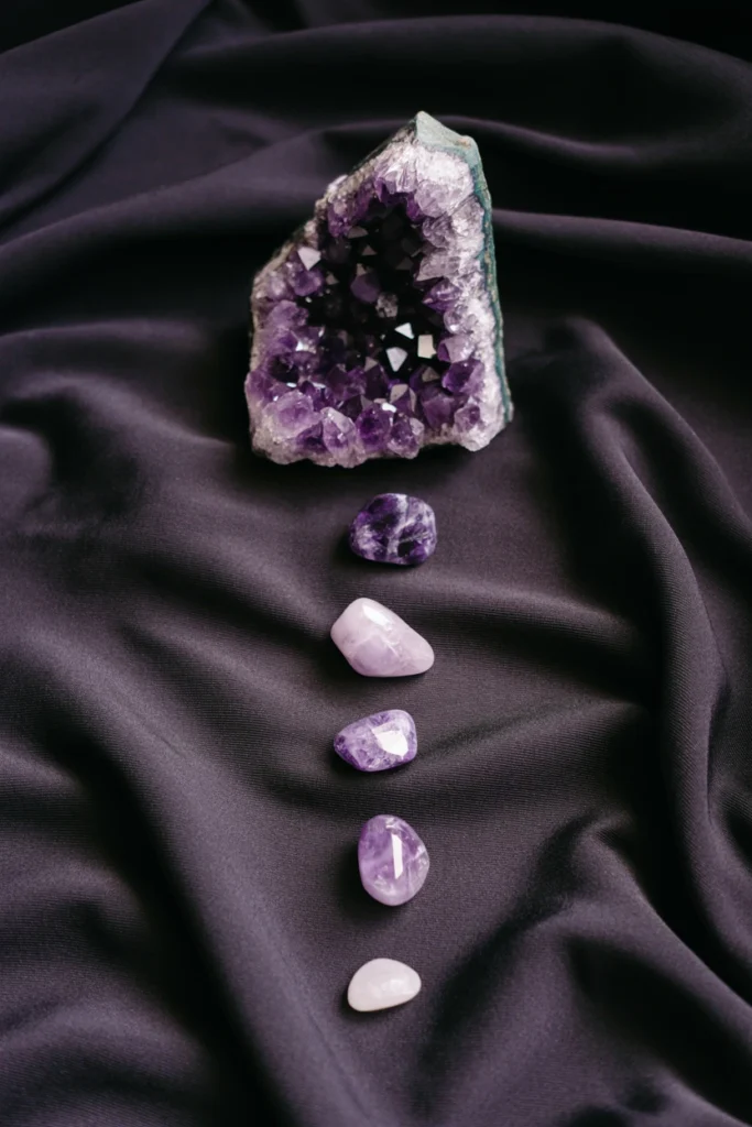
Sorting crystals by color or type alone often results in visual clumps of similar-sized stones that read as a rock collection rather than a display. This clumping wastes the natural sculptural quality that varied crystal sizes provide. Arranging by size instead creates a stepped visual line that guides the eye across the entire display naturally.
Place your largest crystal cluster, 4 inches or taller, at the back of the display and step down to tumbled stones under 1 inch at the front. Leave at least 1 inch of negative space between each size tier so the arrangement reads as layered rather than crowded. This stepped arrangement is what separates a styled crystal display from a cluttered windowsill.
| Crystal Size | Placement in Display |
| 4+ inch cluster | Back row, anchor piece |
| 2–3 inch point | Middle row |
| 1 inch tumbled | Front row |
| Under 1 inch chip | Scattered accent only |
Adding Natural and Botanical Elements to Witchy Apartment Decor
Dried and living botanicals give witchy decor its organic, collected-over-time texture. These four techniques prevent plants from looking like an afterthought.
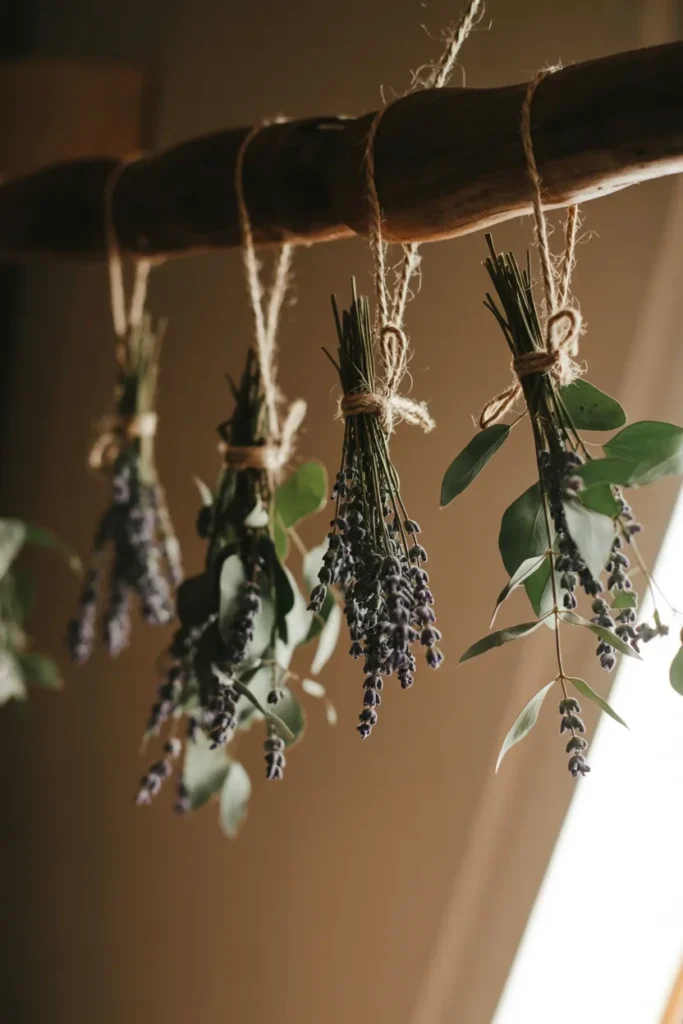
13. Hang Dried Botanicals Upside Down
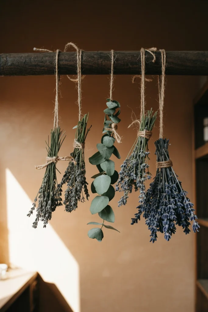
Fresh-cut flowers left in water wilt within a week and leave the display empty until they are replaced. This constant replacement cycle makes the botanical display feel temporary rather than a permanent design feature. Hanging botanicals upside down instead preserves their shape permanently and creates a display that only improves with age.
Bundle 5–8 stems of lavender, eucalyptus, or statice with twine and hang each bundle upside down from a beam or hook for 2–3 weeks. Choose a dark, dry location away from direct sun to preserve color and prevent mold. This drying method is what allows the same botanical arrangement to stay styled for years instead of days.
| Botanical | Drying Time |
| Lavender | 2 weeks |
| Eucalyptus | 3 weeks |
| Statice | 2–3 weeks |
| Baby’s breath | 1–2 weeks |
14. Choose Trailing Vines Over Upright Varieties
Upright plants like snake plants read as generic modern decor rather than contributing to a witchy atmosphere. This mismatch happens because upright growth patterns lack the organic, unruly quality the aesthetic depends on. Trailing plants instead cascade naturally over shelf edges and immediately read as wild and gathered rather than store-bought.
Choose pothos, string of pearls, or ivy in a hanging planter mounted 12–18 inches above a shelf or altar edge. Let the vines grow to at least 24 inches before trimming so they visibly trail past the surface below. This trailing length is what creates the overgrown, apothecary-garden feeling that upright plants cannot replicate.
| Trailing Plant | Light Requirement |
| Pothos | Low to medium light |
| String of pearls | Bright indirect light |
| English ivy | Medium light |
| String of hearts | Bright indirect light |
15. Install a Pressed Flower Frame Gallery
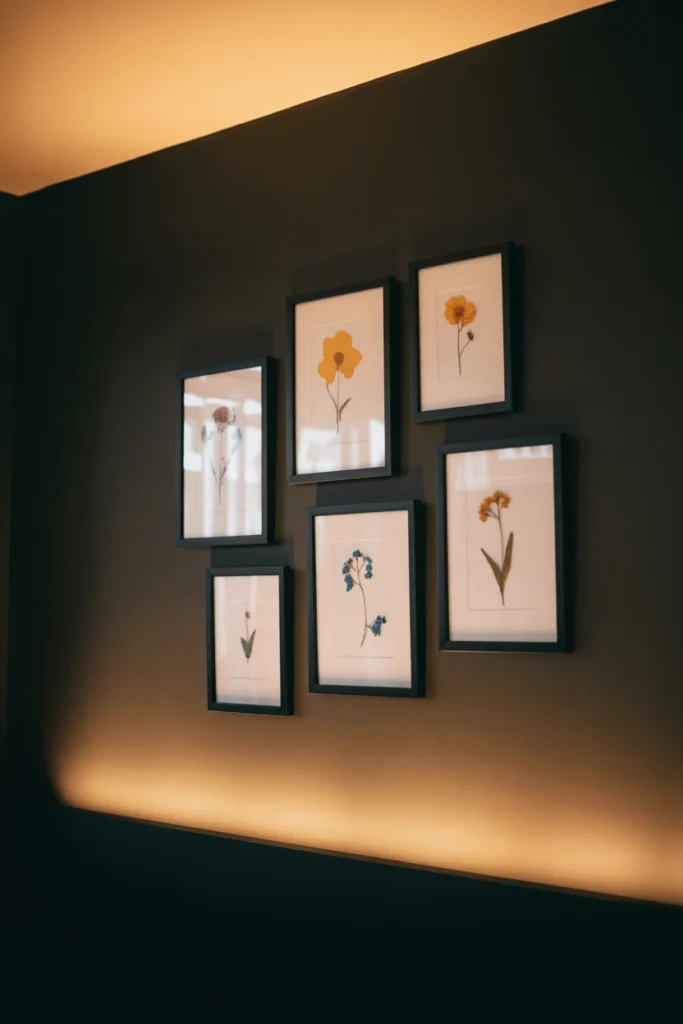
A single dried flower in a vase loses its visual impact within a room full of other dark, textured objects. This single-object approach wastes the intricate detail that pressed botanicals reveal under glass. A gallery of pressed flower frames instead creates a focal cluster that rewards close viewing the way a single dried stem never could.
Press 5–7 flowers between wax paper under heavy books for 2 weeks, then mount each in a black frame between 4×6 and 8×10 inches. Arrange the frames in a cluster with 2-inch gaps, mixing frame sizes rather than matching them exactly. This mixed-size framing is what makes the gallery wall read as an assembled collection instead of a matching set from one store.
| Frame Size | Best Wall Position |
| 4×6 inch | Cluster fill piece |
| 5×7 inch | Cluster fill piece |
| 8×10 inch | Cluster anchor piece |
| 11×14 inch | Standalone focal piece |
16. Replace Plastic Pots With Terracotta or Cast Iron
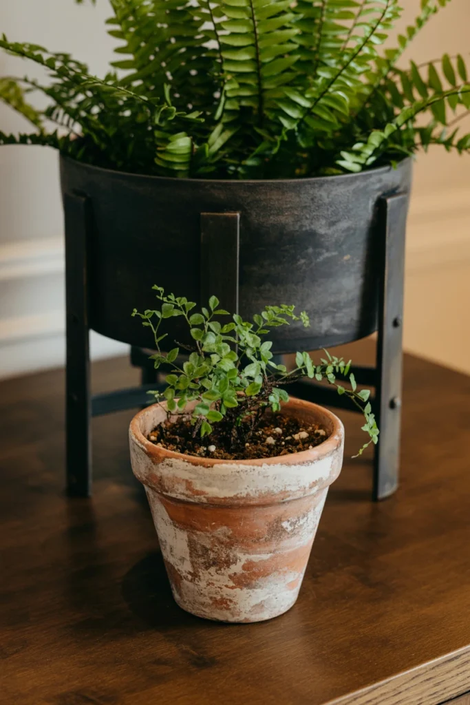
Plastic nursery pots left visible under trailing plants immediately break the aged, apothecary illusion the rest of the room builds. This single overlooked detail undercuts hours of careful styling elsewhere in the space. Terracotta or cast iron pots instead extend the room’s material story down to the smallest object in it.
Repot every visible plant into an unglazed terracotta pot or a black cast iron planter sized 1–2 inches larger than the current root ball. Age new terracotta by rubbing the exterior with a damp tea bag to darken the surface within minutes. This aging trick makes brand-new pots look decades old and consistent with the rest of the room’s patina.
| Pot Material | Best For |
| Unglazed terracotta | Trailing plants, herbs |
| Black cast iron | Statement floor plants |
| Aged copper | Small tabletop succulents |
| Dark stoneware | Kitchen herb garden |
Finishing Touches for a Cohesive Witch Aesthetic Home
The final layer of witchy decor lives in texture and small details. These techniques tie every earlier section together into one finished room.
17. Layer Velvet and Linen Textures Together

A room built from a single fabric texture, even in the right colors, reads as flat and one-dimensional in photos and in person. This flatness happens because texture, not just color, is what creates the sense of depth witchy decor relies on. Layering velvet against linen instead creates visual contrast that makes the same dark palette feel rich instead of heavy.
Pair one velvet throw pillow or curtain panel with linen bedding or upholstery in the same room, keeping the color family consistent. Add a third texture, like a chunky knit throw, in a ratio of roughly 50% linen, 30% velvet, 20% knit. This three-texture mix is what separates a professionally styled room from one that simply matches colors without considering material.
| Texture | Ideal Use |
| Velvet | Pillows, curtain panels |
| Linen | Bedding, upholstery |
| Chunky knit | Throw blankets |
| Raw silk | Small accent cushions |
18. Mount a Moon Phase Wall Piece as a Focal Point
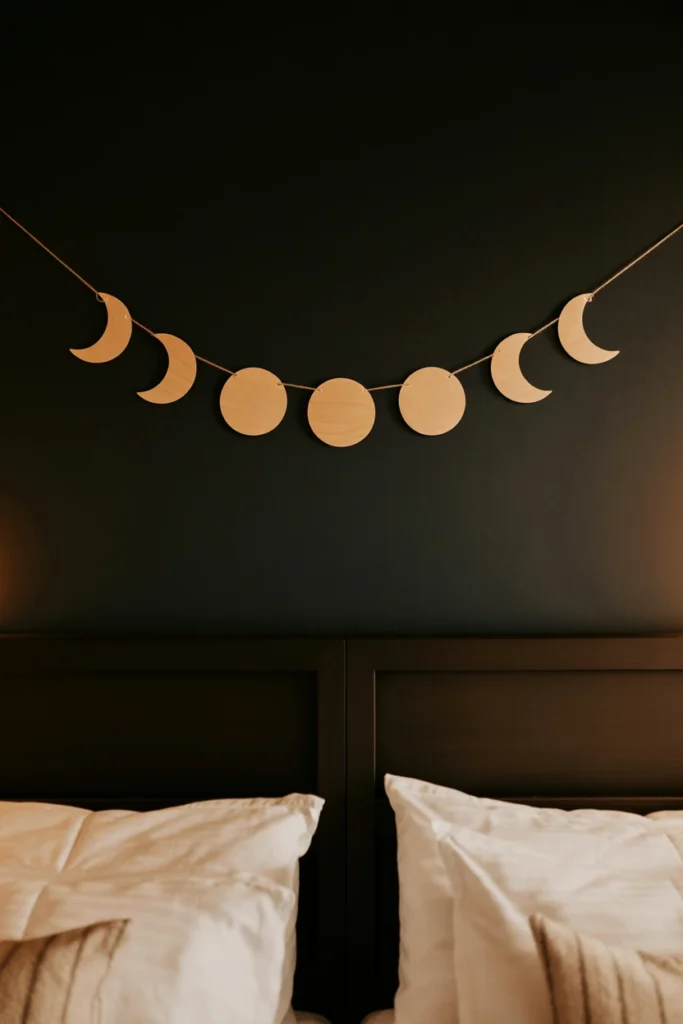
A room without one recognizable symbolic object can look generically dark rather than specifically witchy to a first-time visitor. This ambiguity means guests read the space as moody decor rather than an intentional witchy aesthetic. A moon phase piece instead instantly signals the room’s theme without relying on any single trendy object.
Mount a moon phase garland or wood wall hanging between 24 and 36 inches wide, centered above your altar or bed headboard. Position it 6–8 inches above the furniture below so it reads as a deliberate accent rather than crowding the surface underneath. This spacing rule keeps the piece as a clear focal point instead of visual clutter competing with objects below it.
| Piece Width | Best Placement |
| 24 inches | Above nightstand, small shelf |
| 30 inches | Above dresser, console |
| 36 inches | Above bed headboard |
| 48+ inches | Large focal wall only |
19. Style Your Bookshelf With a Grimoire-Inspired Spine Order
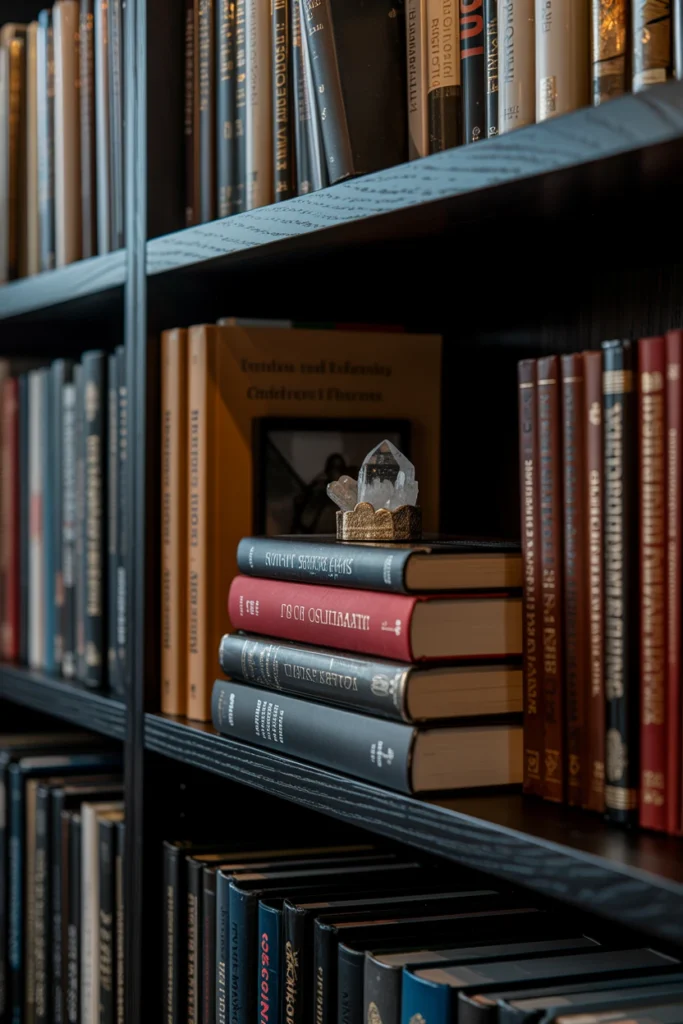
Books arranged by height or color alone often overwhelm a witchy bookshelf with visual noise instead of contributing to the aesthetic. This random arrangement wastes a bookshelf’s potential as one of the room’s strongest styling opportunities. Grouping by dark spine tone with the occasional horizontal stack instead turns the shelf into a deliberate design feature rather than plain storage.
Group at least 70% of visible books with black, brown, or deep red spines together on one section of the shelf. Stack 2–3 books horizontally every third vertical grouping and top the stack with one small object, like a crystal or candle. This horizontal-stack rule breaks up the rhythm of vertical spines and gives the shelf the layered look of a collection built over years.
| Shelf Element | Ratio of Shelf Space |
| Vertical dark spines | 70% |
| Horizontal stacks | 20% |
| Object toppers | 10% |
| Empty negative space | Reserve 1–2 inches per section |
Maintaining Your Witchy Decor Long-Term
Witchy decor is not a one-time purchase; it is a rotating, seasonal practice. This final section covers the single habit that keeps the room from going stale.
20. Rotate Seasonal Elements Every Solstice and Equinox
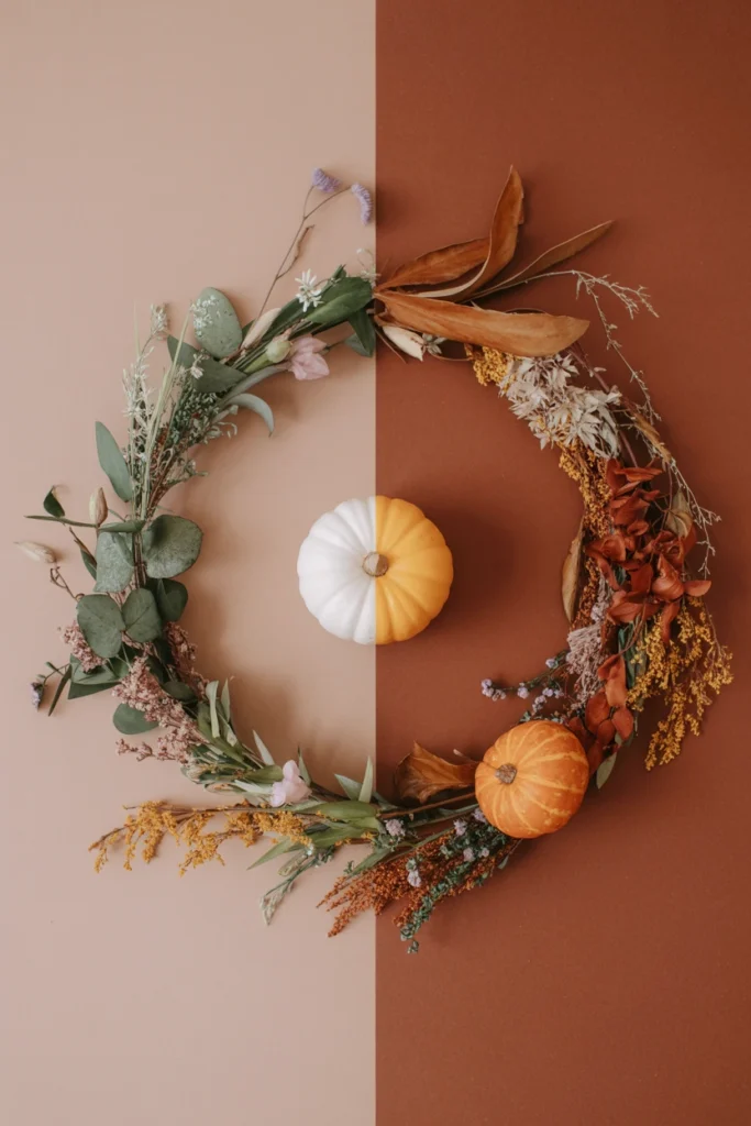
A witchy room left completely static for a full year starts to feel like a museum display rather than a living, personal space. This staleness undercuts the ritual, connected-to-nature quality the aesthetic is built around in the first place. Rotating a small set of seasonal elements four times a year instead keeps the room feeling current and intentional without a full redecoration.
Swap out your altar cloth, dried botanicals, and one accent color at each solstice and equinox, changing no more than 20% of the room’s total objects each time. Store the off-season items in labeled boxes so the rotation takes under 30 minutes each time. This quarterly rhythm is what turns witchy decor into an ongoing seasonal practice instead of a decor style that gets set once and forgotten.
| Season | Rotation Focus |
| Spring equinox | Fresh greenery, pastel accent swap |
| Summer solstice | Citrus tones, lighter textiles |
| Fall equinox | Rust, dried gourds, heavier textiles |
| Winter solstice | Evergreen, candles, deepest tones |
Common Witchy Decor Mistakes That Break the Illusion
These eight mistakes are the most frequent reasons witchy decor reads as a costume theme instead of a genuine personal aesthetic.
| Mistake | Why It Hurts the Space | Better Alternative |
| Using only Halloween store props | Reads as seasonal costume, not permanent decor | Invest in real dried botanicals and stone objects |
| Mixing more than 3 accent colors | Creates visual noise that hides the focal points | Limit the palette to one base and two accents |
| Overcrowding the altar surface | Makes the space read as clutter, not ritual | Cap altar objects at nine pieces maximum |
| Skipping layered lighting | Flattens texture and kills the atmosphere | Add at least three separate light sources |
| Using fake plastic crystals | Reads as cheap and undermines material authenticity | Buy raw or tumbled natural stone only |
| Matching every metal finish | Looks sterile instead of collected over time | Mix two metals at an 80/20 ratio |
| Leaving plastic nursery pots visible | Breaks the aged, apothecary illusion instantly | Repot into terracotta or cast iron |
| Never rotating seasonal elements | Room feels static and eventually neglected | Swap 20% of objects each solstice and equinox |
Witchy Decor by Space and Style
Small Bedroom
A small bedroom forces every witchy decor choice to work harder because floor space for large furniture pieces does not exist. The core constraint here is vertical space, not horizontal, so styling decisions shift upward toward walls and shelves.
Key strategies for small bedrooms:
- Mount a floating altar shelf instead of using a dresser top
- Choose a single dark accent wall behind the headboard only
- Hang botanicals from the ceiling corner instead of a full wall
- Use a slim 12-inch windowsill ledge for crystal display
- Limit candle clusters to one nightstand only
Rental Apartment
Rental restrictions on paint and permanent fixtures mean witchy decor has to rely entirely on removable, temporary techniques. The core constraint is avoiding any wall damage while still achieving a dark, layered look.
Key strategies for rental apartments:
- Use a large tapestry instead of painting a focal wall
- Attach hooks with removable adhesive strips rated for 5+ pounds
- Choose a freestanding altar table instead of mounted shelving
- Swap out light fixture bulbs rather than replacing fixtures
- Layer area rugs over existing flooring for texture
Budget Witchy Decor
Building witchy decor on a tight budget means prioritizing which few objects create the most visual impact per dollar spent. The core constraint is spending selectively rather than buying every trending object at once.
Key strategies for budget witchy decor:
- Dry your own herbs and flowers instead of buying pre-dried
- Thrift dark wood frames and repaint hardware black yourself
- Collect tumbled stones individually rather than buying sets
- Repurpose existing glass jars with black paint instead of buying new
- Prioritize one large tapestry over several small decor pieces
Dark Academia Witchy Decor
Combining witchy decor with dark academia means balancing scholarly, bookish elements against the more mystical apothecary side of the aesthetic. The core constraint is keeping both halves visually connected rather than competing.
Key strategies for dark academia witchy decor:
- Prioritize leather-bound and cloth-spine books over paperbacks
- Add brass desk lamps instead of string lights for task lighting
- Choose tweed and wool textiles alongside velvet
- Display botanical specimens in glass cloches rather than jars
- Mount vintage maps or astronomy charts near the altar wall
Frequently Asked Questions
How do I start witchy decor from scratch?
Start with your color palette before buying any objects, choosing one dominant dark tone for 60% of the room. Add a dedicated altar surface next, since this single addition signals the room’s purpose immediately. Build outward from there with layered lighting and dried botanicals rather than buying everything at once.
What colors are considered witchy decor?
Deep jewel tones like emerald, garnet, and aubergine form the base of most witchy decor palettes. Black is used for hardware and framing rather than full walls, paired with aged gold or brass metallics. A small warm accent like rust or blood orange keeps the overall palette from feeling cold.
Can witchy decor work in a small apartment?
Small apartments actually suit witchy decor well because the style relies on layered detail rather than large furniture pieces. Floating shelves, windowsill displays, and wall-mounted altars let the aesthetic thrive in under 100 square feet. The key constraint is limiting object count so the small space reads as curated, not crowded.
How much does witchy decor cost to start?
A basic witchy decor setup can start under $100 using thrifted frames, self-dried herbs, and a single tapestry for the focal wall. Costs rise mainly with crystal collections and furniture, which can be added gradually over time. Prioritizing one large statement piece, like a tapestry, gives the most visual impact per dollar.
What’s the difference between witchy decor and cottagecore?
Witchy decor leans darker and more ritual-focused, built around altars, apothecary jars, and moody lighting. Cottagecore favors light, airy palettes with florals and pastel tones instead of jewel tones and black accents. The two styles can overlap through dried botanicals, but their color stories move in opposite directions.
How often should I change my witchy decor setup?
Rotate roughly 20% of your objects four times a year, at each solstice and equinox, to keep the space feeling current. This quarterly rhythm avoids the cost and effort of a full redecoration while still refreshing the room. Altar cloths, dried botanicals, and one accent color are the easiest elements to swap each season.
Is witchy decor just crystals and candles?
Crystals and candles are common elements, but the aesthetic depends just as heavily on color palette, texture layering, and lighting design. A room with only crystals and candles on a plain white wall will not read as witchy decor. The full effect comes from combining color, texture, botanicals, and lighting together.
What plants work best for witchy decor?
Trailing plants like pothos, string of pearls, and ivy work best because their cascading growth suits the aesthetic’s organic, gathered feel. Dried lavender, eucalyptus, and statice add texture without the maintenance of living plants. Upright plants like snake plants tend to read as more modern than witchy.
How do I make witchy decor look intentional not cluttered?
Group objects in odd numbers of three or five, and cap any single surface at nine total objects. Leave visible negative space between groupings so each vignette reads as deliberate rather than crowded. Sticking to one dominant color palette across the whole room also prevents individual objects from competing for attention.
Conclusion
Witchy decor comes together through a defined color palette, a dedicated altar surface, and layered lighting working in combination. Start with the foundation steps first, choosing your base color and altar location before adding a single object. Rearrange your existing candles into odd-numbered groupings at varied heights tonight to see the immediate difference.
The full effect of witchy decor builds gradually through consistent seasonal rotation, not a single weekend of shopping. A room styled with intention, restraint, and real material choices reads as genuinely mystical rather than costumed.